

Visual Communication in the Workplace: Why Labels and Label Materials Matter
See also: Business WritingMost workplace communication training focuses on speaking, writing, and listening. Labelling is discussed far less often, even though a label is often the only piece of communication that stays in place long after the person who wrote it has gone home.
Think about how much of a working day runs on small printed instructions. Which switch does what. Which cupboard holds the first aid kit. Which container holds a cleaning chemical and which holds something safe to pour down a sink. A label is an instruction delivered without a person attached to it, which means it has to work with no tone of voice, no body language, and no chance to answer a follow-up question.
That's a demanding brief for a rectangle of printed material. Worth taking seriously.
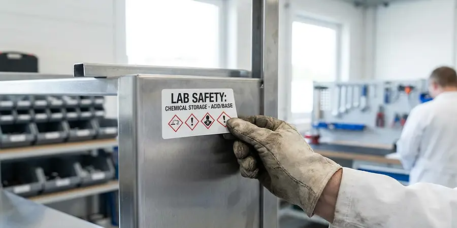
Labels Are Read Under Pressure
The circumstances in which someone reads a label are rarely ideal. They're carrying something. They're in a hurry. They're new and don't want to ask a third question in ten minutes. Sometimes they're dealing with a spill or an alarm.
Visual communication works differently from a conversation because the reader can't ask for clarification in the moment. Whatever ambiguity you leave in the wording stays there permanently, and any uncertainty gets filled in by guesswork at the worst possible moment.
Good labelling assumes a distracted reader with about two seconds of attention. Design for that person, not for the one sitting calmly at a desk.
Where Labelling Stops Being a Matter of Preference
Plenty of workplace labelling is discretionary. Some of it isn't.
In Great Britain, Health and Safety Executive (HSE) guidance on the Health and Safety (Safety Signs and Signals) Regulations 1996 explains that safety signs are required where a significant risk to health and safety remains after other control measures have been put in place. HSE is clear that signs must be legible, and warns against putting up so many signs that they cause confusion.
That second point gets overlooked. A wall covered in warnings communicates less than a wall with three. Anything that becomes visual wallpaper stops being read, which is a specific failure mode worth watching for in any workplace that has been adding notices for years without removing any.
Chemical containers, electrical equipment, fire safety points, and personal protective equipment requirements all sit inside a regulatory framework. If your labelling touches any of those, check the current rules rather than copying what the last person did.
Writing a Label Someone Can Read in Two Seconds
The most common labelling mistake is writing too much. The second is writing too little and assuming context will fill the gap.
A few habits that help:
- Lead with the noun, not the qualifier. "Waste solvent" beats "For disposal of used solvent only," because the reader needs to identify the thing before reading any conditions.
- Use the words your colleagues say out loud. If everyone calls it the back store, labelling it "Auxiliary Storage Area 2" adds a translation step nobody needed.
- Avoid long strings of capital letters. Word shape aids recognition and capitals flatten it, so save them for a single word or a short warning.
- Put the action before the explanation. Someone scanning for what to do shouldn't have to read past a rationale to find it.
- Date anything that expires. A wrong label is worse than no label, because it carries false authority.
None of that is difficult. It requires writing the label deliberately rather than in the thirty seconds before a delivery arrives.
Colour Coding and Its Limits
Colour coding is fast, which is why it works. Red for one waste stream and blue for another can help people sort correctly without reading every label.
The limit is that not everyone sees the distinction you're relying on. Colour vision deficiency affects around 1 in 12 men and 1 in 200 women according to the NHS, with red and green among the most commonly confused. A system where red and green mean opposite things is a system that fails silently for part of the workforce, and the people affected often won't flag it.
The fix is straightforward. Never let colour be the only carrier of meaning. Pair it with text, a symbol, a shape, or a position. Colour then becomes the fast route for people who can use it, and everyone else still gets the information.
The Material Carries the Message
A well-written label that peels off in week three can't keep communicating when it's needed most. This is the part that gets decided last and causes the most avoidable problems.
Choosing between the main types of label materials comes down to what the label has to survive. Paper labels are inexpensive and take print well, which suits shelf edges, filing, and anything indoors and dry. Synthetic materials such as vinyl, polypropylene, and polyester hold up against moisture, handling, and cleaning products, which is why they turn up on equipment, chemical containers, and anything that gets wiped down regularly.
Surface matters as much as material. Adhesives behave differently depending on the surface, including painted metal, plastic, powder-coated finishes, and cardboard. Curved or textured surfaces need a label material flexible enough to sit flat without lifting at the edges. A protective laminate can improve resistance to abrasion and many cleaning chemicals, and is worth the small extra cost anywhere a label gets touched daily.
Then there's whether you want it to come off. Removable adhesives suit rotating stock, project boards, and shared equipment. Permanent adhesives suit safety marking and asset tagging, where a label that peels is a liability rather than an inconvenience.
Getting this wrong tends to be self-correcting in the worst way: the labels fail, people stop trusting the system, and someone starts writing on masking tape again.
The Habits That Quietly Undermine Good Labelling
Handwritten labels aren't inherently bad, but they signal something. They usually mean the official system is too slow or too awkward to use, so people route around it. Worth investigating rather than banning.
Inconsistent naming causes more confusion than missing labels. If a store is called three different things across three doors, staff learn to ignore the labels and rely on memory, which defeats the point.
Old labels left in place are the most damaging habit of all. A decommissioned machine with its original operating instructions still attached, a cupboard labelled for contents that moved two years ago: these mislead. Removal should be part of any change, not an afterthought.
Putting Good Labelling Into Practice
Labelling works when someone owns it. That means an agreed format, a decision about who can create labels, and a review point where old ones get pulled down.
None of this needs to be elaborate. A single page covering naming conventions, which material to use where, and who to ask when something new needs labelling will cover most workplaces. The value is in having one answer rather than six.
Visual communication is still communication. Like any workplace skill, it works when the message is clear, consistent, and easy to act on. Good labels help people make the right decision even when nobody is there to explain what the label means.
Take a fresh look around your workplace and ask whether every label communicates clearly, consistently and accessibly—because even small improvements can prevent confusion, support safer decisions and make everyday communication more effective.